July 18, 2025
I know, I know. You're heading to the beach this weekend and you want pictures, not words. You can't see all those words on a screen in the bright sunlight, and anyway it's summer.
Before I dive into a visual festival of charts, I want you to keep in mind the risk of fitting the story to the data you are looking at. It is very easy these days, in finance (or politics) to believe something, and then just find some data that matches that belief.
In his 2012 annual letter, Buffett wrote about this problem:
I ask the managers of our subsidiaries to unendingly focus on moat-widening opportunities, and they find many that make economic sense. But sometimes our managers misfire. The usual cause of failure is that they start with the answer they want and then work backwards to find a supporting rationale. Of course, the process is subconscious; that is what makes it so dangerous.
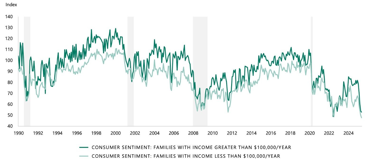
Let's get the negative out of the way. People are in a terrible mood, with consumer confidence hitting it's lowest level in 35 years (including the Global Financial Crisis) across income groups both below and above $100k:
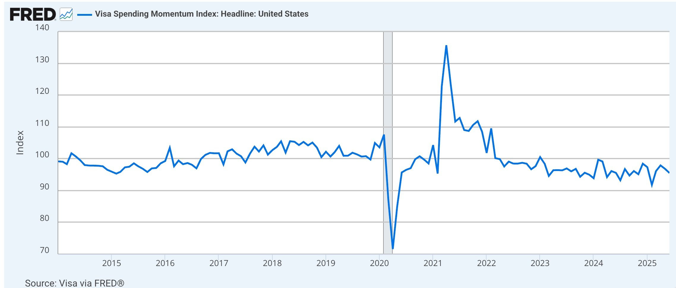
This is spending momentum, from VISA. Below 100 on the chart means spending momentum is below its long-term average rate.
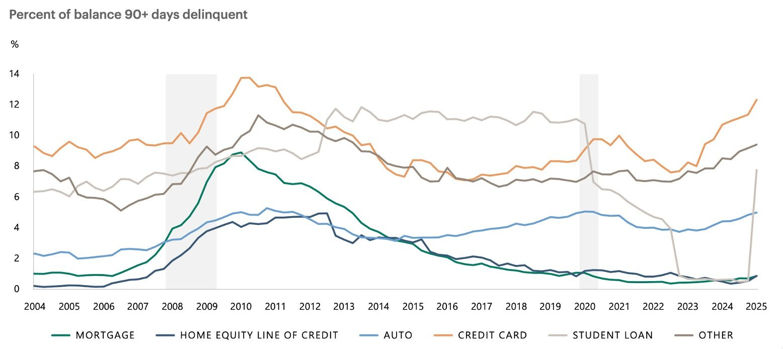
But the spending isn't always paid for. Here is a chart of debt types, more than 90 days delinquent. Note the surge in credit card debt not being paid, as well as student loans:
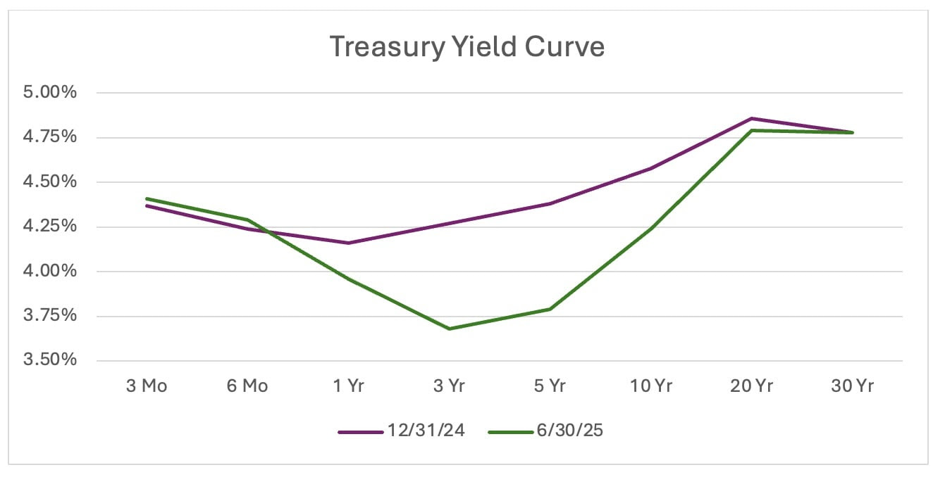
Onto rates. We have a "positive butterfly twist" yield curve. (Throw that term out at tonight's lobster bake on the beach.) The green line is as of June 30th. The dip in the three-five-year yield shows that investors expect rate cuts in the relatively near future. They are buying in the three to five year range to lock in rates, without exposing themselves fully to the duration risk further out the curve.
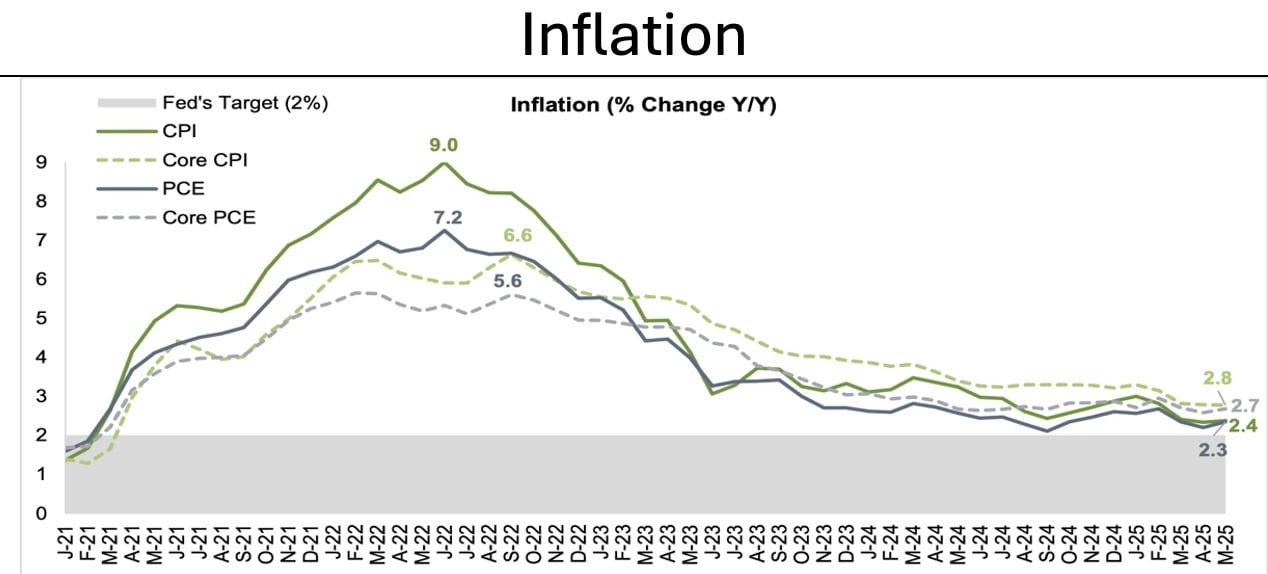
Inflation is not back to the Fed's 2% target yet, adding some uncertainty to the rate cut debate:
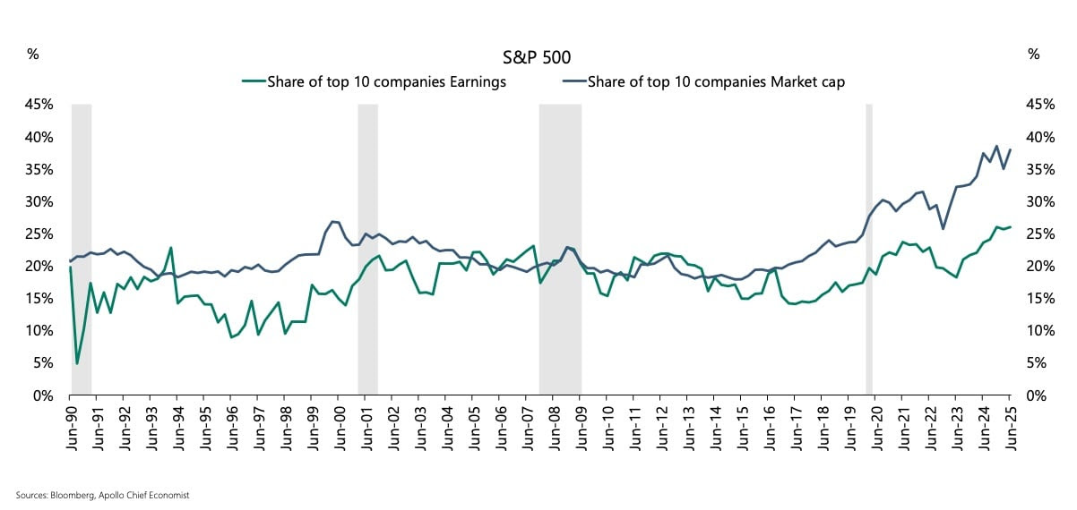
In the S&P 500, concentration is the highest it has been in 35 years. Note that the market is not necessarily wrong. The "Magnificent 7" tech firms have done a magnificent job creating high-growth monopolies for themselves that are difficult for competitors to attack, and the market reflects this. Profits are not quite as dominant as index share, primarily due to: 1. Spending on AI infrastructure is suppressing profits in the Magnificent 7 and, 2. The price-earnings ratio of the Magnificent 7 as a group is higher than that of the S&P 500. (For more reading on this, here is a 2023 newsletter I wrote.)
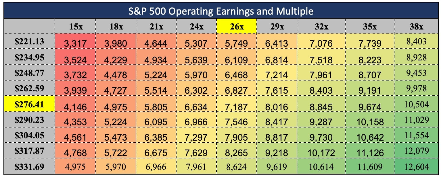
Ok, last chart. Here are the potential operating earnings of the S&P 500 for 2025 (y-axis) and the potential price-earnings trailing multiple (x-axis). Currently analysts expect 2025 earnings in the $260 to $270 range, and the current trailing multiple is about 26. Today the S&P trades at $6,307. You can play some visual checkers on this chart to see how a change in either the earnings or the multiple will affect the price of the S&P 500.
Ok that was a lot to absorb! Have a nice, hot weekend!
Dan Cunningham
Graph Sources:
1. Consumer Sentiment: Apollo Mid-Year Outlook 2025.
2. VISA Momentum: Visa via FRED.
3. Credit cards delinquent: Apollo Mid-Year Outlook 2025.
4. Treasury Yield: U.S. Treasury
5. Inflation: Sifma U.s. Economic Survey Mid-Year 2025.
6. Concentration: Apollo.com June 2025
7. S&P Operating Earnings and Multiple: S&P Global

v 2.4.116 | © One Day In July LLC. All Rights Reserved.
